
What is the first thing someone sees on your website………..
You guessed it, the header! This is why they play a key role in grabbing the user’s attention and establishing a connection between you and your website visitor.
So what are the header design principles to follow?
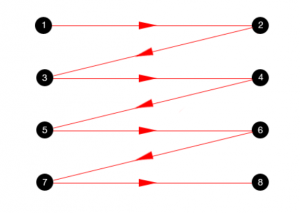
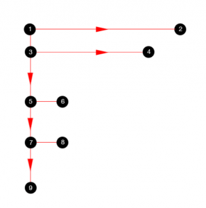
Research studies have found that the user’s eyes move on a webpage by following one of three patterns:
The Gutenberg pattern
The Gutenberg diagram describes a general pattern the eyes move through when looking at text-heavy copy. Think pages in a novel or a newspaper.
Example:
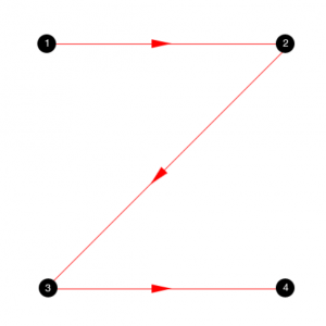
The Z-shaped pattern
As you would expect, the Z-pattern layout follows the shape of the letter ‘z’. Readers start in the top-left, move horizontally to the top-right and then diagonally to the bottom-left, before finishing with another horizontal movement to the bottom-right.
Example:

The F-shaped pattern
The F-shaped pattern allows readers to scan text easily and is used particularly when there is a lot of content on a web page. Its layout feels comfortable to most western readers who are used to reading from top to bottom/left to right.
Example:
- Videos' - www.nytimes.com_international")
Website Header elements
- Strong hero image
- USP
- Branding
- Product video – if applicable
- Feature product or service
- Trust signals, e.g., third-party review sites, to take users to a download with information
- Get visitors to sign up to something
- Familiarity
- Call To Action (CTA) focused
Best practice for a website header
- Use minimal text – keep it simple
- Be impactful
- Offer context
- Provide a direction that you want the visitor to take
What size should a website header image be

Examples of header images for inspiration
Scoro
This header image conveys a lot of information in a short period of time. It allows the user to try for free, or request a demo, and quickly gets across the key message.

Netflix
This header includes a call to action, answers the reason why you might not want to sign up, gives an incentive to sign up as well as allowing existing users to sign in.

Hyer
Hyer has created an animated header that captures attention. It has two clear calls to action as well as a clear message.

Charity Water
This charity header example puts donations at the top of the page to encourage people to take action. The video shows a very clear message and story about the charity.

Green Mountain Energy
This header allows you to enter your postcode to find a service plan. It also has a video that will give a lot of information in a short period of time.

See Gallery
Talk to us today about your banner design!
