Are you getting the most out of LinkedIn? Networking with potential customers, landing contracts and increasing your brand awareness? Or is it just something you log in to, look at confused and click away, adamant your customers aren’t there anyway.
Here’s something that might shock you: You’re missing out on millions of potential clients.
That’s right – millions.
LinkedIn has 760-million users spanning over 200 countries. And 40% of those log in every day. All of which means if you’re not utilising LinkedIn, you’re missing out on customers who might be desperate to work with you.
Creating your eye-catching LinkedIn profile
Creating a LinkedIn profile that’s almost guaranteed to act as a lead generation magnet takes a little work, but the benefits to your business are massive. And to reap those benefits, all you need to do is implement our step-by-step guide below:
1. Your profile image
The most important rule here is: Smile.
Why?
Because a smiling profile picture is 14x more likely to be viewed and 8x more likely to receive a connection request. It’s one of the easiest things to get right on your LinkedIn profile, yet many users go with a super-serious profile image that can put a customer off.
So, to make sure you get yours right, here are a few do’s and don’ts:
DO:
- Use a plain background
- Get a professional to shoot your photo (where possible)
- Smile naturally (say words like pizza, ninja and papa, these words end with a natural smile that doesn’t look forced in photos)
- Use good lighting
- Wear industry-appropriate clothing
- Take the picture from the elbow up
- Make sure your face covers 60% of the image area
DON’T:
- Never use lifestyle images; this is a professional platform
- Make sure clothing doesn’t overpower the image
- Don’t have your eyes closed
- Never have your mouth shut as it can look like you’re smirking
- Don’t use an old/outdated photo
- Never look away from the camera; look into the lens
- Don’t wear a hat or sunglasses
- Never use an overly sexual image
If you’re looking to create an influencer or legacy profile. Or you want to add a little bit of fun and personality to your profile, you can:
- Use an image of yourself in your work setting (On stage, filming, etc.)
- Add a bit of humour (like Erin L’Hommedieu at Disney)
- Show yourself as you want to be seen (strong, imposing, funny, goofy, etc.)


2. Your header image.
As humans, we only remember 20% of what we read. But we remember 80% of what we see – so your headline banner needs to be treated like an advert.
You need to:
- Use a striking image
- Include your logo
- Tell customers what you do
- Include an irresistible call to action
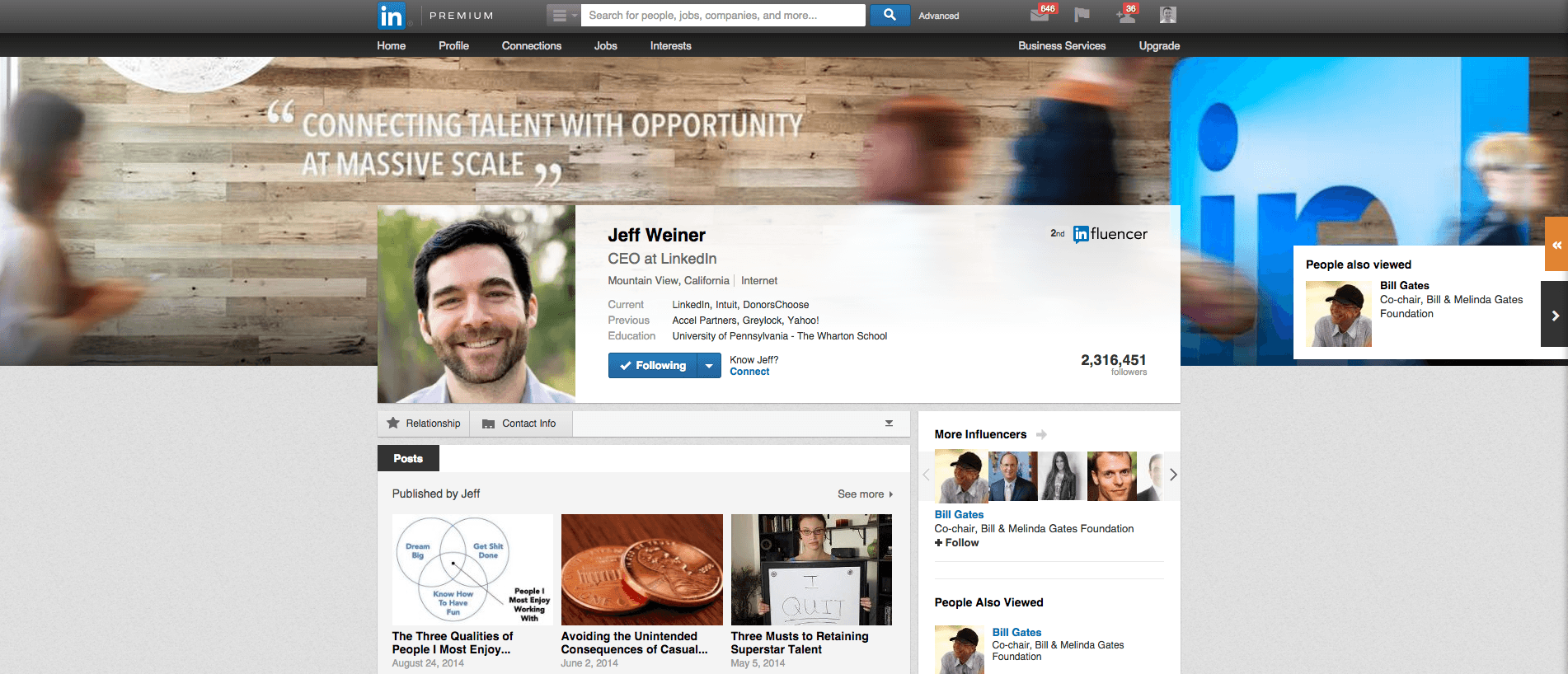
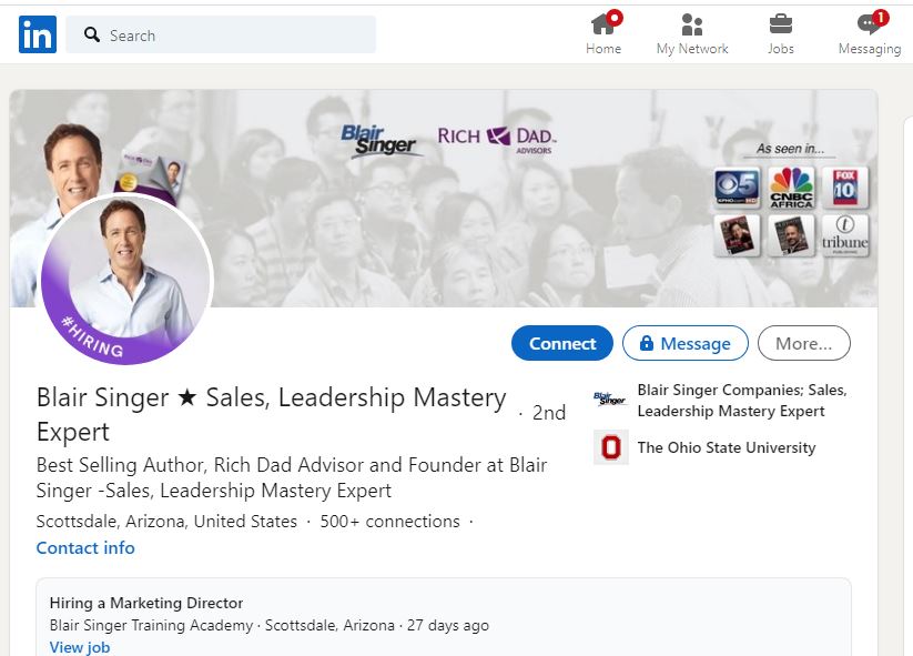
Examples of Header Images


3. Your headline.
Your headline is super-important because it tells potential customers who you are and what you do. And there are two approaches to this:
- Client Facing
Headline: Helping (type of client you are trying to attract) achieve (their outcome) by (the results you achieve)
or
Headline: Your title | Your outcome | Reviews - Influencer Facing
Headline: Your title| What you do (e.g. Podcaster, influencer in social, Social Media Guru, etc. - Legacy
Headline: A mission statement that’s bigger than you (e.g. Helping climate change, one tree at a time)
You should also use emojis.
Yes, you read that right. But that doesn’t mean littering your profile with smilies, winks and tongue-pulling emojis.
Use emoji that compliment you and your business, like:
- ⭐
- ✅
Emojis add life to your profile but make sure not to overdo it.
4 Your About section
Your About section is where you can differentiate yourself from your competitors and create a personalised experience for the user. So it needs to be engaging and persuasive.
But before you delve into writing it, ask yourself the following questions:
- What do your competitors offer their clients?
- Do you provide the same or similar service?
- What is different (and better) about what you’re offering?
- Can you back up your claims?
Once the writing is underway, make sure to include keywords for search purposes. Make your tone warm and friendly. Answer basic questions about your skills, like what you do and how you do. This will compel potential customers to read on.
And most importantly, make sure it’s customer-focused.
Yes, it’s YOUR profile. But like the About section on your website, it needs to touch on the pain-points your customers are feeling and why you are the person to solve all their problems.
Examples of Great LinkedIn Headers


5. Your Featured section
Many LinkedIn users often under-utilise this section because they’re not sure what it’s for.
So, by utilising it, you’re going to be one step ahead of your competitors.
The Featured section is where you can include lots of lead magnets, like links to your website homepage, your services page or to helpful blog posts and articles that’ll make your customers’ lives a whole lot easier.
In just one click, they’re on your website. And if that rocks, you’re one step closer to snagging them as a customer.
Five. Your Experience section
Or, as you might think of it, the CV bit.
This is where you list all your previous jobs. For most LinkedIn users, it reads very blandly. Listing your current job right through to your first Saturday job.
Boring!
Your experience section is key to persuading a potential customer to connect with you. So add keywords into every job you’re done which are relevant to what you’re doing now.
And don’t stop there.
Make sure you explain:
- What you do
- How you do it
- Why it works
For example, here’s my current ‘Experience’ section:

By optimising my experience section and including emoji, not only does it tell potential customers everything they need to know. It helps it rank higher on search engines too.
But that’s not all.
It’s also the ideal place to include client testimonials too:
:- Google ⭐⭐⭐⭐⭐ 26 reviews
“We have been working with Pink Elephant Media for around 6 months now when we decided to rebuild our website and launch our e-commerce store. They have been a great support and full of ideas to help us develop our online presence. Thank you for all your help.” – Tom Bowles | Hartley Farm
“Can’t recommend Pink Elephant Media enough, we had our first enquiry within an hour of the site going live.” – Chani | MM Promotions
Your experience sets you apart – so make sure you utilise it to the max.
And you can go further to stand out too.
If you wear lots of hats in your business (like a web designer, copywriter, Lead Generation Specialist, etc.), split each ‘speciality’ into its own defined section, giving you more opportunities to include searchable keywords.
To show you how to do this, just watch the video below:
6. Your Skills & Endorsements section
Don’t leave this section blank. It’s a quick and easy way to list what you’re good at. Once you’ve added as many as you can, ask people and clients who know you. Or who you have worked with to endorse you.
7. Your Recommendations
There’s nothing better than a bit of social proof, so make sure your happy clients leave you a testimonial on your LinkedIn page.
Think about how many of your clients are on LinkedIn who you’ve never asked to endorse you?
If they’ve given you a testimonial in the past, send them a direct message and ask if they can copy and paste it into the Recommendations section. And sweeten the deal by giving them a ringing endorsement too.
Make your LinkedIn profile stand out.
You only get one chance to make a first impression. And on a professional platform like LinkedIn, you stand a chance of making hundreds and thousands of first impressions every day.
So, make sure your LinkedIn profile catches the eye.
But if you don’t have time, Pink Elephant Media can help.
Get in touch and let’s have a chat about how we can help you impress your customers on LinkedIn.
Until next time,
Henny
