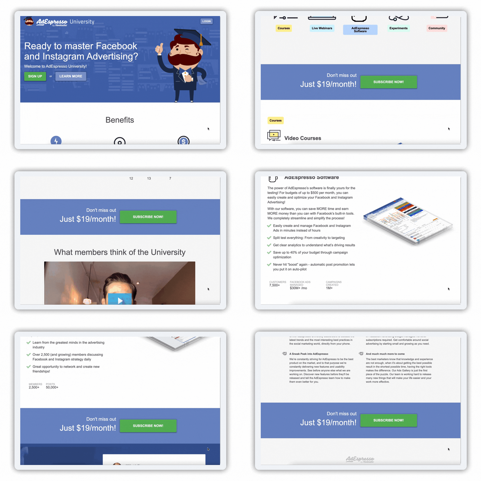
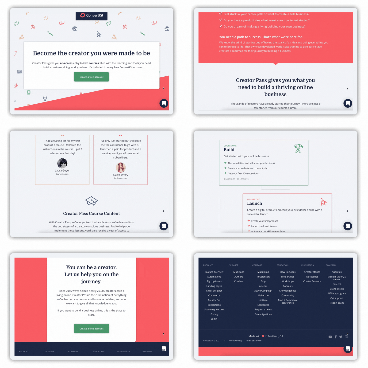
You have spent hours creating a course, recording it and adding it to your website. So what is the best way to promote your course? A course landing page!
Below are some examples of course landing pages and a checklist of what elements are needed to create a strong landing page.
What is needed on a course landing page?
A course landing page is a stand-alone web page that you can send your marketing to. This landing page needs to:
- Have a strong hero banner
- Include an enticing call to action, e.g., Sign up to your free trial; Create a free account
- Have a clear and concise message with no jargon
- Be clear on the benefits and features of the course
- Speak the clients’ language to show you understand issues they have faced and how you can solve them
- Talk about what they will have after they have taken the course, e.g., “After this course you will be….”
- State the costs
- Social proof against your competitor’s courses
- Give an incentive to follow you on social media
- Show course modules
- Have an FAQ page
- Say who the course is for
- Say who their instructor is
Below are some examples of well-designed courses pages


